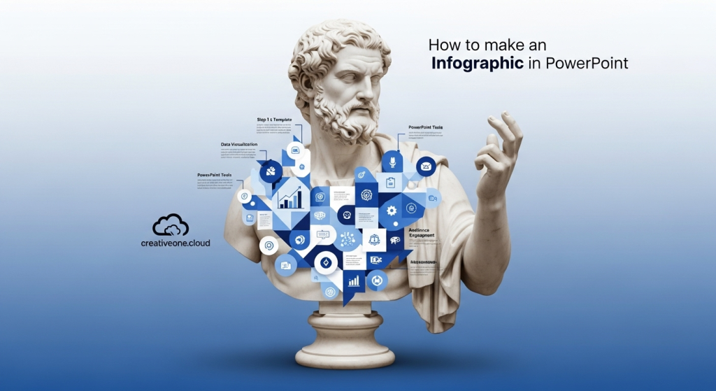
We’ve all been there: looking at a spreadsheet with fascinating data points or a complicated workflow and wondering, “How do I make this interesting?” Now for the infographic! And guess what? A simple PowerPoint can be transformed into an efficient infographic tool with a few clever tricks. Now for the infographic! And guess what? A simple PowerPoint can be transformed into an efficient infographic tool with a few clever tricks. If you need professional help turning your complex data into a stunning infographic, our team at creativeone.cloud can help. Let’s look at how to use PowerPoint to make interactive infographics rather than bullet points.
Let’s look at how to use PowerPoint to make interactive infographics rather than bullet points. A standard PowerPoint presentation design can be transformed into an efficient infographic tool with a few clever tricks. Let’s look at how to process infographics with PowerPoint instead of bullet points.
Why Even Bother with Infographics?
Let’s quickly go over why infographics are so useful before we start building:
They Get People Interested: Pictures get through the noise much better than plain text.
They make things easier to understand: make hard data or processes easier to understand by breaking them up into smaller pieces.
They help people remember: Presentations that only have text are not as good at helping people remember things as ones that have pictures.
You can share them: For social media, reports, or presentations, a well-designed process infographic that is well-designed is great.
Are you ready to make your data sing? Are you ready to make your data point sound good? Let’s get going!
Step 1: Infographic Planning (the “Brainstorm & Sketch” stage)
This step, which starts before you even begin PowerPoint, is probably the most important.
What is your message’s main point? There is one main story in every great infographic. What is the one thing you want your audience to remember the most?
Who Is Your Audience? Are they experts? Beginners? This influences your language, complexity, and visuals style.
Collect Your Information/Data: Gather all the information you wish to include, such as steps, numbers, or concepts. Ensure that your data is current and accurate!
Sketch It Out! Take out a pen and paper, or a whiteboard that can be used digitally. This is really helpful. Consider the layout of your information. Will it be a process, a comparison, a timeline, or a statistical analysis? How will the viewer’s attention move from one fact to the next? This rough outline will be your guide.
Step 2: Configure in the PowerPoint Canvas (beyond the standard slide).
Even though PowerPoint slides have a ‘ default widescreen format, infographics often appear better with taller, narrower, or even custom proportions. Start a blank PowerPoint presentation: Start fresh. Custom slide dimensions: Click “Slide Size” (usually on the right) under the “Design” tab, then select “Custom Slide Size.”
Choose your orientation and dimensions:
“Portrait” orientation is often ideal for social media or a standalone graphic design. Depending on how much content you have, attempt sizes like 8.5 by 17 inches and even wider at 10 by 20 inches. Standard pixel sizes, like 1080 by 1920 (for Instagram Stories), are also great if you want to create visuals for social media.
Use landscape mode if it’s for a conventional presentation, but you can still play around with the height/width ratio.
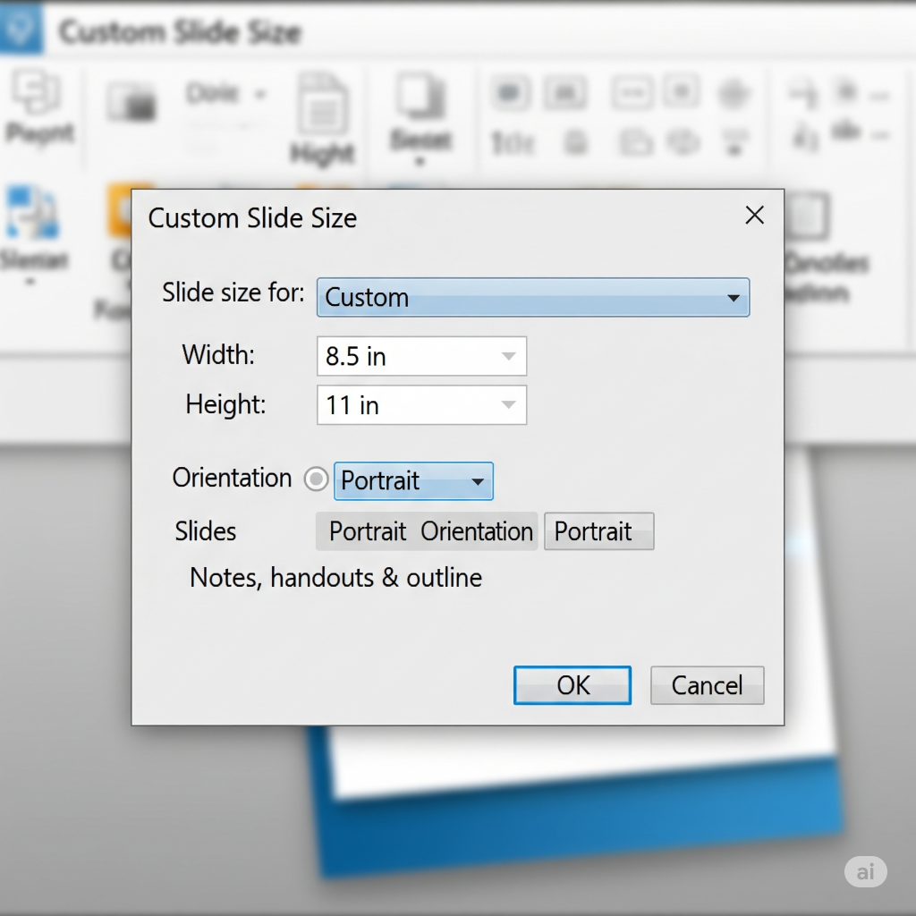
Click “OK” and then “Ensure Fit” to adjust your slide to the new dimensions.
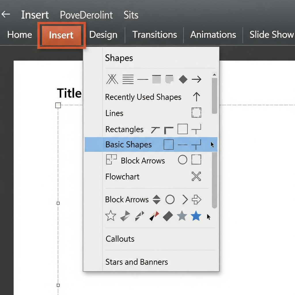
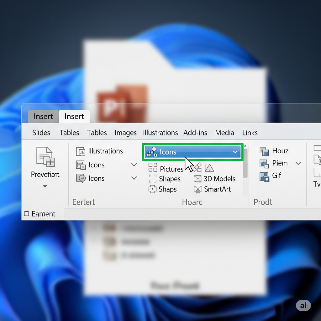
Step 3: Foundational Elements: Icons, Shapes, and SmartArt (Your Design Toolkit)
Now for the fun part—bringing your sketch to life! PowerPoint has a surprising array of tools.
Shapes (Insert > Shapes): These are your best friends. Create sections, text backgrounds, dividers, and visual flow using rectangles, circles, lines, and custom shapes. To keep precise proportions (for squares, circles, etc.), hold Shift while dragging. Icons (Insert > Icons-Only for Microsoft 365): The integrated icon library is a veritable gold mine if you have a Microsoft 365 subscription! Look for terms like “money,” “idea,” and “growth” that are associated with your data. Since these are scalable vector graphic designs (SVGs), you can easily alter their colors, and they look good at any size.
If you need custom icons or a full design solution, the experts at creativeone.cloud are here to help.
This unsung hero of infographic template is SmartArt (Insert > SmartArt). Pre-made changes for lists, processes, cycles, hierarchies, and relationships are referred to for SmartArt graphics. They are very simple to edit and automatically adjust as you add text.
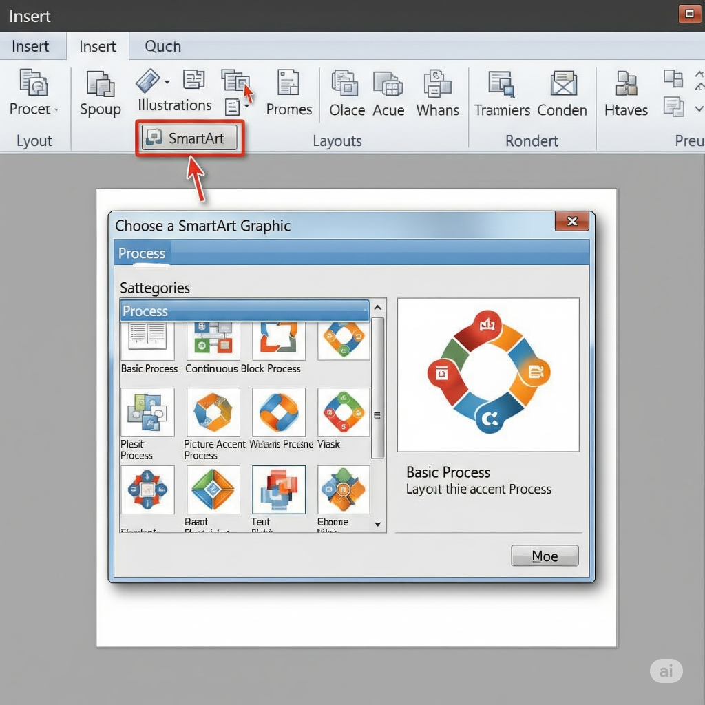
Look into choices like “Process” for in-depth manuals, “Hierarchy” for organizational charts, and “Relationship” for Venn diagrams. You can change the colors and styles after inserting.
Text Boxes (Insert > Text Box): Make sure your writing is clear and powerful. Use varying font sizes for your headings, subheadings, and body text to establish a unique visual hierarchy.
Step 4: Include Your Data and Put It Into Visual Form (Making Numbers Pop)
This is where your research turns into visuals.
Charts (Insert > Chart): For numerical data, PowerPoint’s charts are excellent.
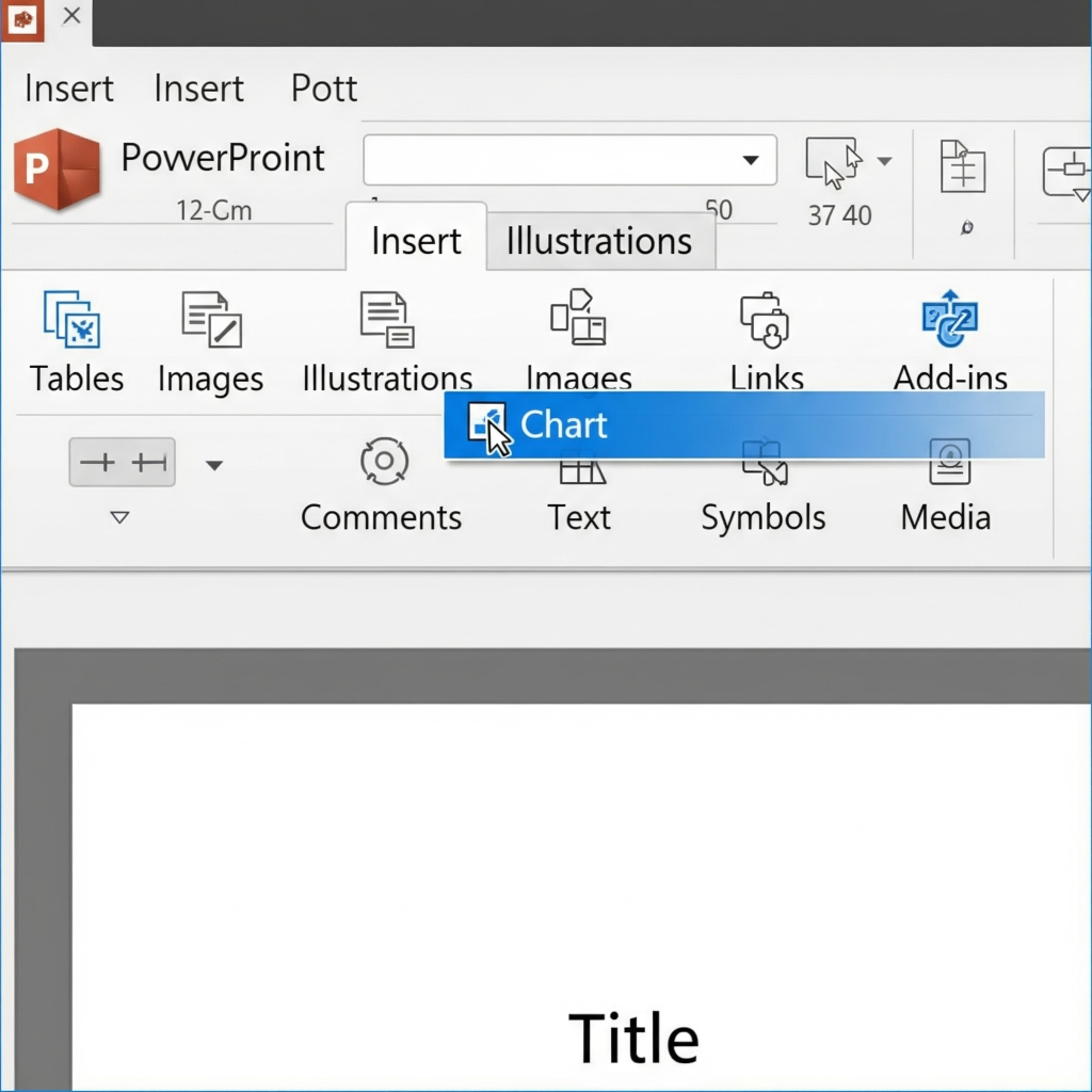
Bar/Column Charts: Great for comparing values.
Pie Charts: Best for showing parts of a whole (but use sparingly and for only a few categories).
Line Graphs: Perfect for showing trends over time.
Insert your chart, and an Excel sheet will pop up for you to input your data.
Visualizing Non-Numerical Data:
Use icons to represent categories or quantities (e.g., 5 person icons instead of the number 5).
Create progress bars using filled shapes.
Use arrows and lines to show connections or flow.
Step 5: Design Principles: The Secret Sauce for “Human” PowerPoint Infographic
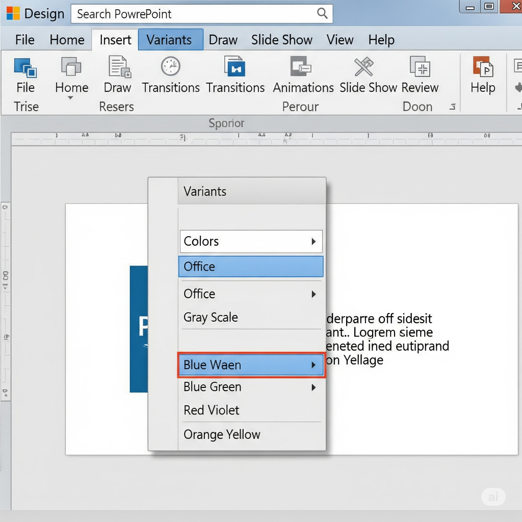
This is what turns your infographic slide into with data points on it. Design > Variants > Colors > Color Scheme: Use no more than two or three primary colors and neutrals (such as black, gray, and white) and, if appropriate, your brand’s colors. Don’t use too many colors to overwhelm your audience; the “Variants” feature in PowerPoint can assist you in selecting color schemes that assist your complex data. Font Selections (Design > Variants > Fonts): Use no more than one or two readable fonts—one for body text (something easy to read) and one for headings (perhaps something bold or unique). Consistency is key!
Your Friend Is White Space: Avoid packing too much information in! Distribute your components in the space to breathe. White space, also known as “negative space,” makes your infographic easier to read and less cluttered. This is what turns your infographic slide and data into a truly captivating image.
Design > Colors > Color Scheme > Variants: Limit yourself to over two or three primary colors and neutrals (like white, gray, and black). Use your brand’s colors when appropriate. Don’t overwhelm your audience with color. PowerPoint’s “Variants” feature can assist you in selecting matched color schemes.
When selecting your fonts (Design > Variants > Fonts), use no more than one or two readable fonts. One for the body (something readable and clear) and one for the headings (something bold or unique, maybe). The secret is consistency!
Don’t overfill; white space is your friend! Allow space for your components to breathe. White space, also known as “negative space,” reduces the size and readability of your infographic.
Visual Hierarchy: Engage the viewer. Important information should be bolded, enlarged, or colored differently to draw attention to it.
Verify that the text is the same size, color, and style for all associated visual elements, including icons, titles, and information labels.
Step 6: Check it out, prove changes, and export!
Almost done!
Edit everything: Spelling mistakes undermine credibility. Read the entire text carefully.
Check the data’s accuracy: Check each statistic, percentage, and fact one more time.
Obtain Input: Have someone else review your PowerPoint infographic template. Are they getting the message? Does it make sense? Is there anything unclear?
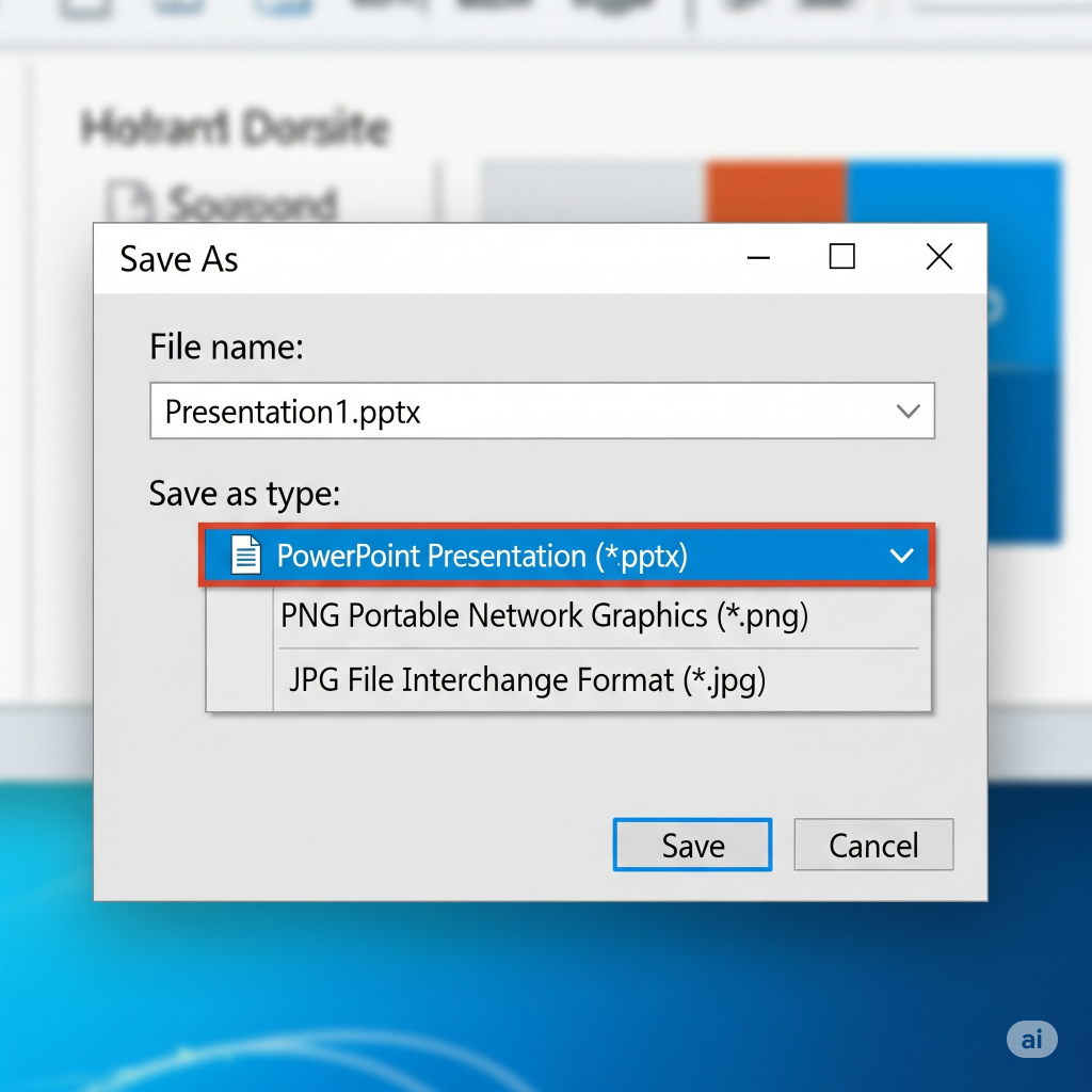
Export as a Picture: Save your infographic design as a high-quality image after you’re done viewing it.
Select “File” > “Save As.”
From the “Save as type” dropdown, choose “PNG” (for background transparency, if applicable) or “JPG” (for general use). PNG quality is more useful than JPG quality.
You will come in made in PowerPoint to notify you of avoiding “Just This One” or “All Slides.” Select “Just This One.”
Using PowerPoint for infographic design is a remarkable ability that requires both creativity and reasoning. You can quickly transform complicated data into useful, visually appealing images with a little practice. So picture yourself at home! Export as a Picture: When you’re done looking at your infographic template, save it as a high-quality image.
Select “File” > “Save As.”
Choose “PNG” (for translucent surfaces, if needed) or “JPG” (for general use) from the “Save as type” dropdown. JPG quality is not as useful as PNG quality.
PowerPoint will alert you to the need to avoid “Just This One” or “All Slides.” Choose “Just This One.”
Using PowerPoint for infographic design is a remarkable ability that requires both creativity and reasoning. You can quickly transform complex data into useful, visually appealing content with a little practice.. So, imagine at home!bility that requires both creativity and reasoning. You can quickly transform complicated data into useful, visually appealing images with a little practice. So picture yourself at home! Export as a Picture: When you’re done looking at your infographic, save it as a high-quality image.
Select “File” > “Save As.”
Choose “PNG” (for translucent surfaces, if needed) or “JPG” (for general use) from the “Save as type” dropdown. JPG quality is not as useful as PNG quality.
PowerPoint will alert you to the need to avoid “Just This One” or “All Slides.” Choose “Just This One.”
Using PowerPoint to create infographics is a remarkable ability that requires both creativity and reasoning. You can quickly transform complex data into useful, visually appealing content with a little practice.. So, imagine at home!
You can quickly transform complex data into useful, visually appealing content with a little practice. To take your presentations and infographics to the next level, explore our professional design services at creativeone.cloud.
